Documentation Index
Fetch the complete documentation index at: https://support.eqtble.com/llms.txt
Use this file to discover all available pages before exploring further.
Table of Contents
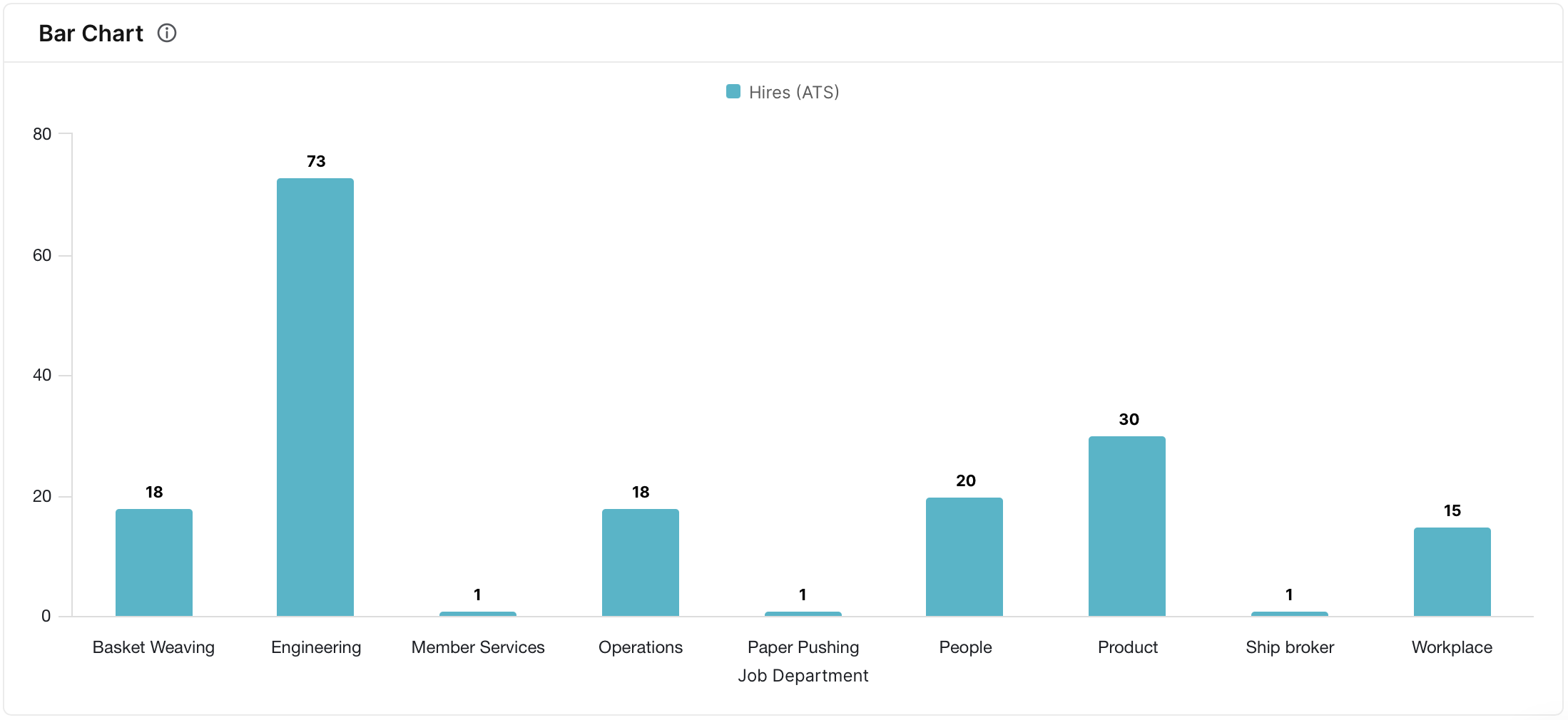
Bar Chart
The Bar Chart is a visual representation of data using rectangular bars, with the length of each bar corresponding to the magnitude of a specific metric. It is a straightforward and effective way to compare the values of different categories, making it useful for quick and easy data comparison.
To create a bar chart:
- add at least one metric and one breakdown
- set visualization type to bar chart
- enable value labels
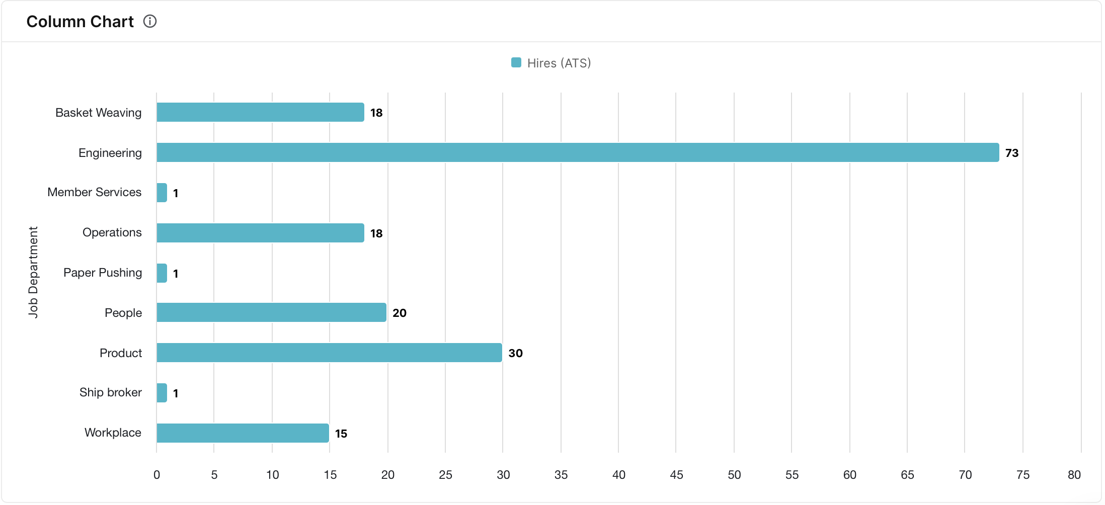
Column Chart
Similar to the bar chart, the Column chart uses vertical bars to represent data values. It is employed when a vertical orientation is preferred or when dealing with lengthy category names, offering an alternative visual presentation for effective data analysis.
To create a column chart:
- add at least one metric and one breakdown
- set visualization type to bar chart
- In configure menu, enable horizontal chart and value labels
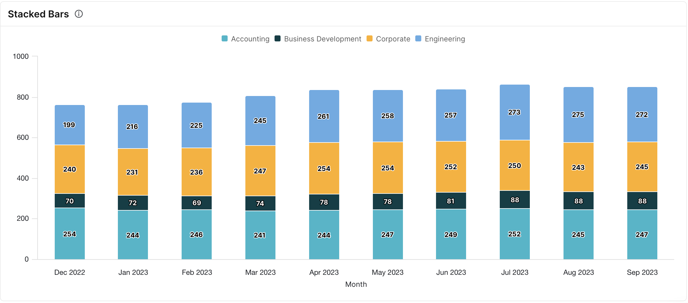
Stacked Bars
A Stacked Bar chart is a graphical representation of data that uses bars to represent values, with each bar divided into segments or “stacks” to illustrate the contribution of different components to the total value of each category. It is useful for comparing the overall size of categories as well as the relative proportions of the contributing elements within each category.
To create a Stacked Bars chart:
- add one metric and two breakdowns
- set visualization type to bar chart
- In configure menu, enable stacked bars and set the dropdown next to stacked bars toggle to absolute
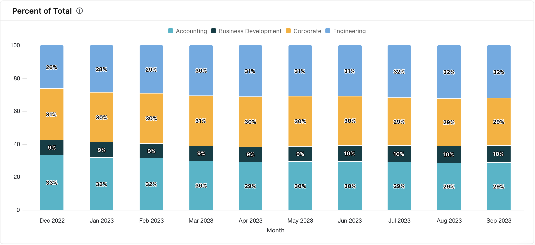
Percent of Total
The Percent of Total chart illustrates the relative contribution of each category to the overall total, representing the percentage share of a specific metric across different categories or dimensions. It is useful for gaining insights into the distribution and significance of individual elements within the entire dataset.
To create a Percent of Total chart:
- add one metric and two breakdowns
- set visualization type to bar chart
- In configure menu, enable stacked bars and set the dropdown next to stacked bars toggle to percent
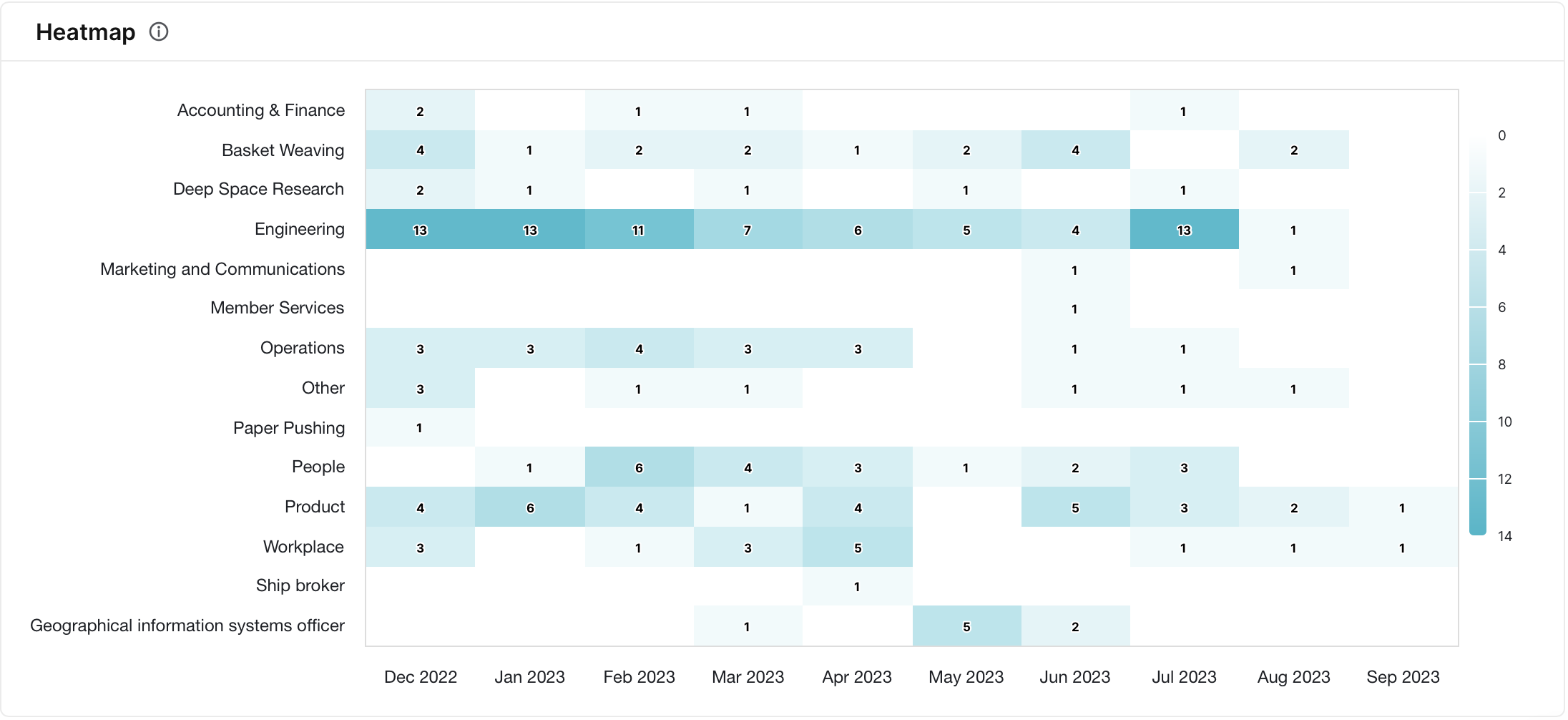
Heatmap
A Heatmap is a graphical representation of data where values are depicted as colors on a two-dimensional matrix. It is particularly useful for visualizing the intensity or concentration of a metric across two categorical variables, providing a quick and intuitive way to identify patterns and trends in large datasets.
To create a heatmap chart:
- add one metric and two breakdowns
- set visualization type to heatmap
- enable value labels
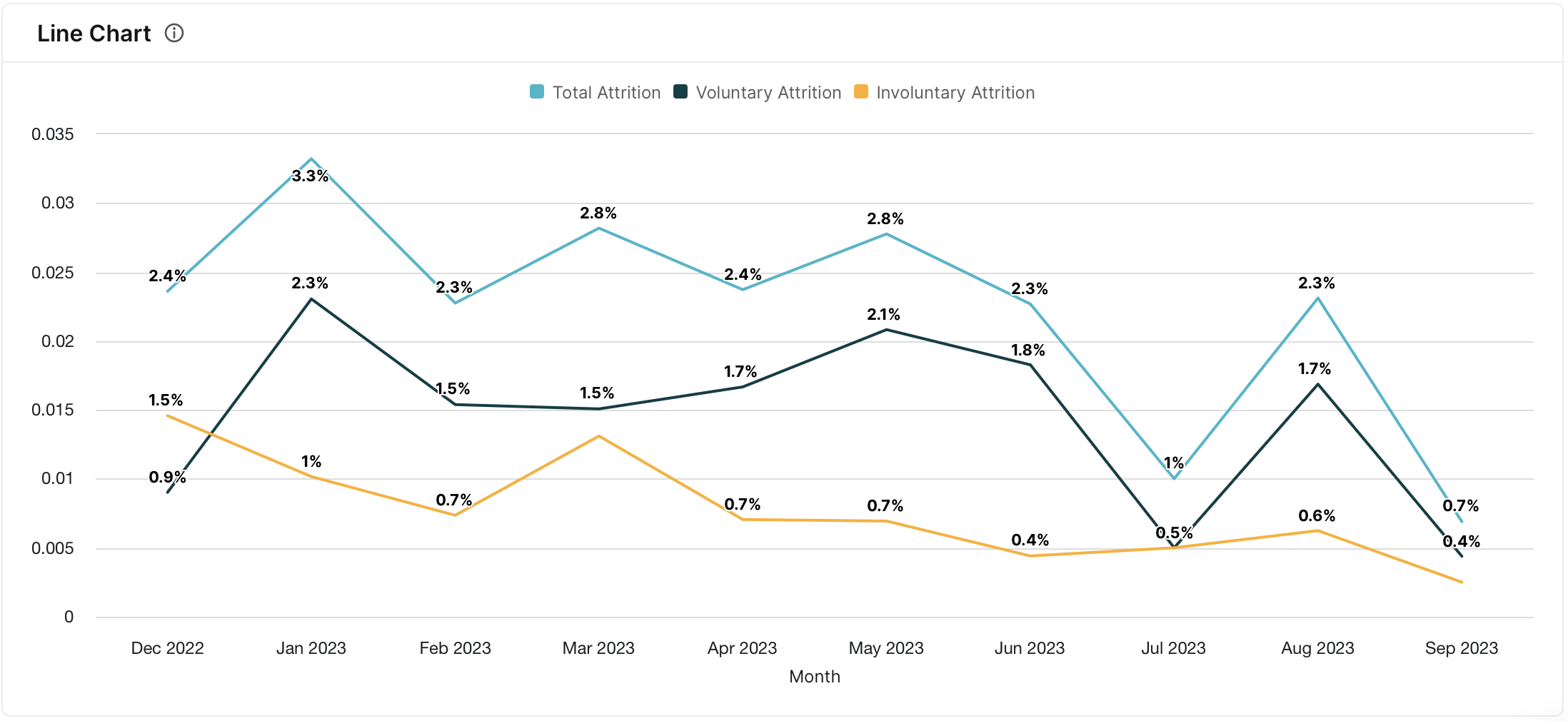
Line Chart
A Line Chart represents data points with connected lines, typically used to visualize trends and changes over a continuous dimension. It is a powerful tool for displaying patterns and fluctuations in data over time, making it useful for trend analysis and forecasting.
To create a line chart:
- add at least one metric and one breakdown
- set visualization type to line chart
- In configure menu, enable value labels
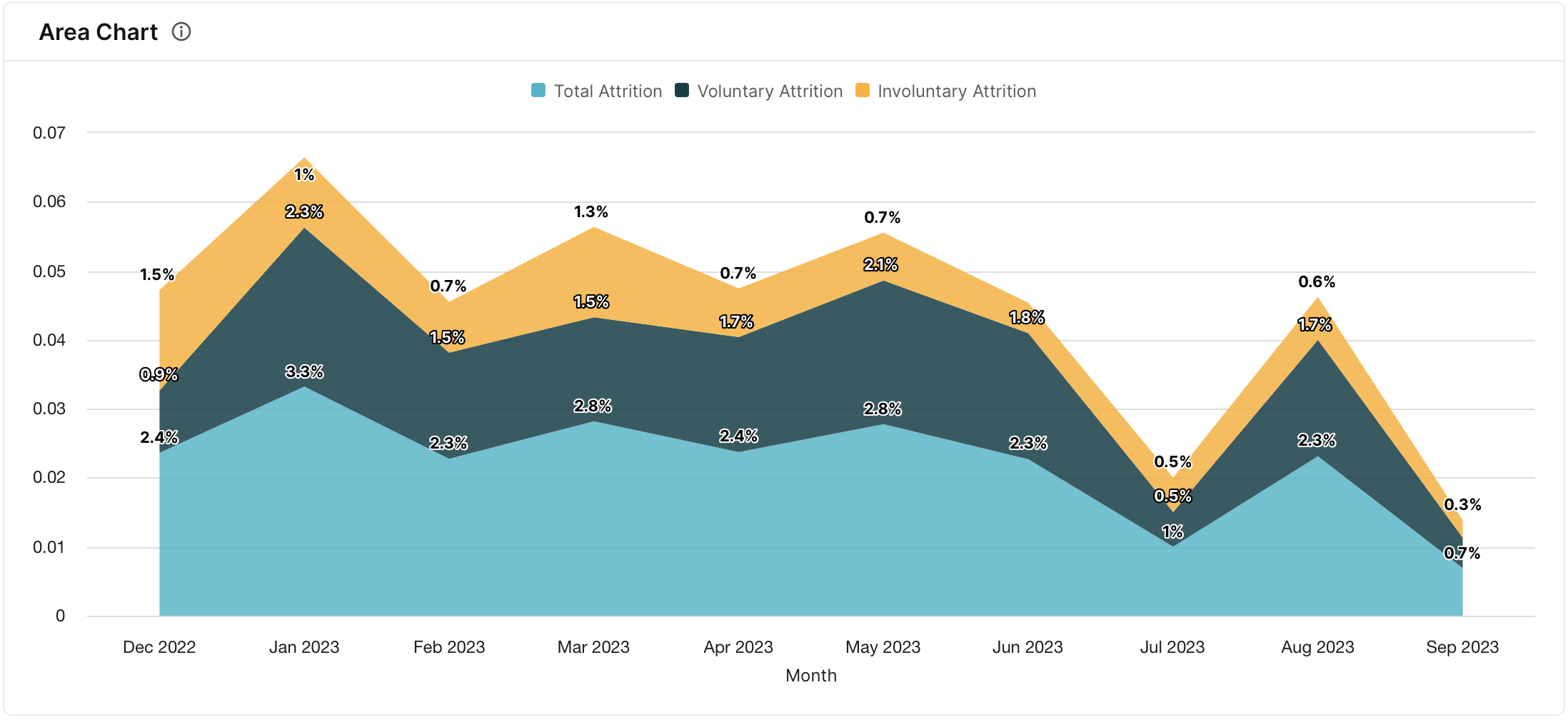
Area Chart
Similar to the Line Chart, the Area chart emphasizes the area beneath the line. It is useful for illustrating cumulative values over a continuous dimension, providing a visual representation of the overall magnitude and trends within a dataset.
To create an area chart:
- add at least one metric and one breakdown
- set visualization type to line chart
- In configure menu, enable stacked lines and value labels
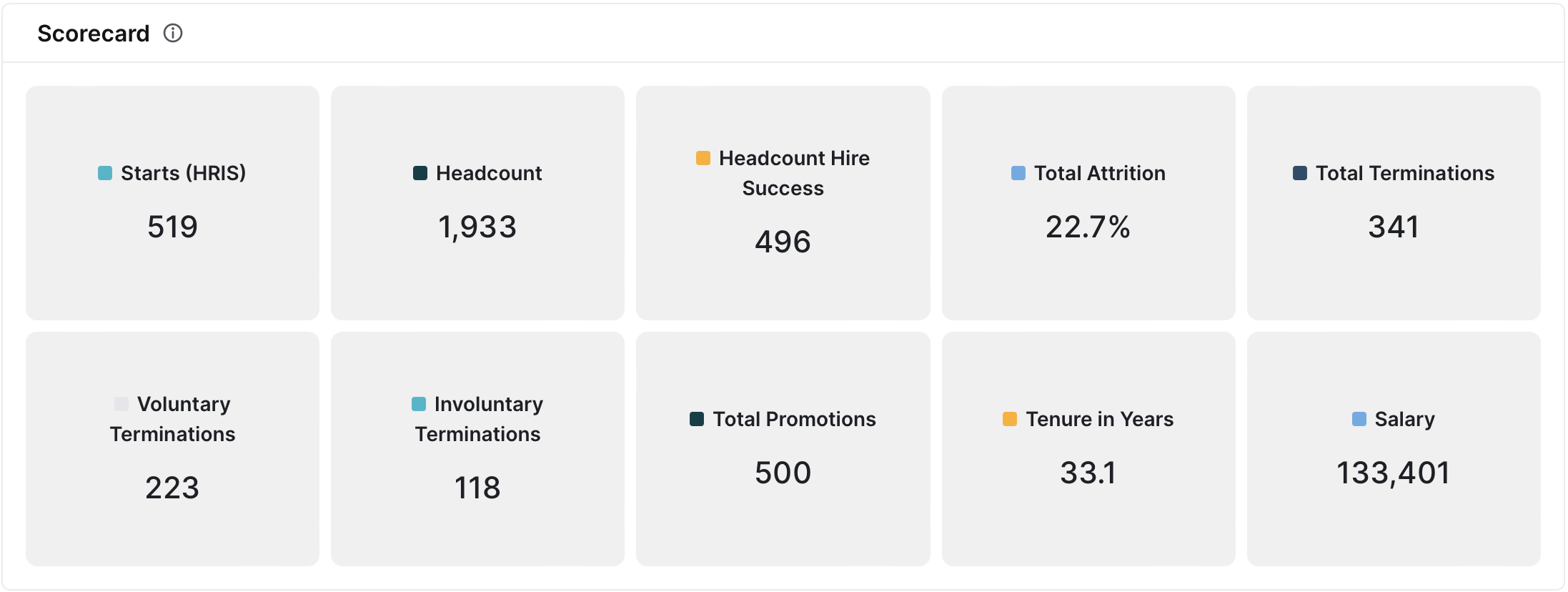
KPI Scorecard
A KPI Scorecard is a visual representation that compiles key performance indicators (KPIs) and summary metrics into one view. It is useful for highlighting core people metrics at a high-level.
To create an KPI scorecard:
- add at least one metric
- set visualization type to scorecard
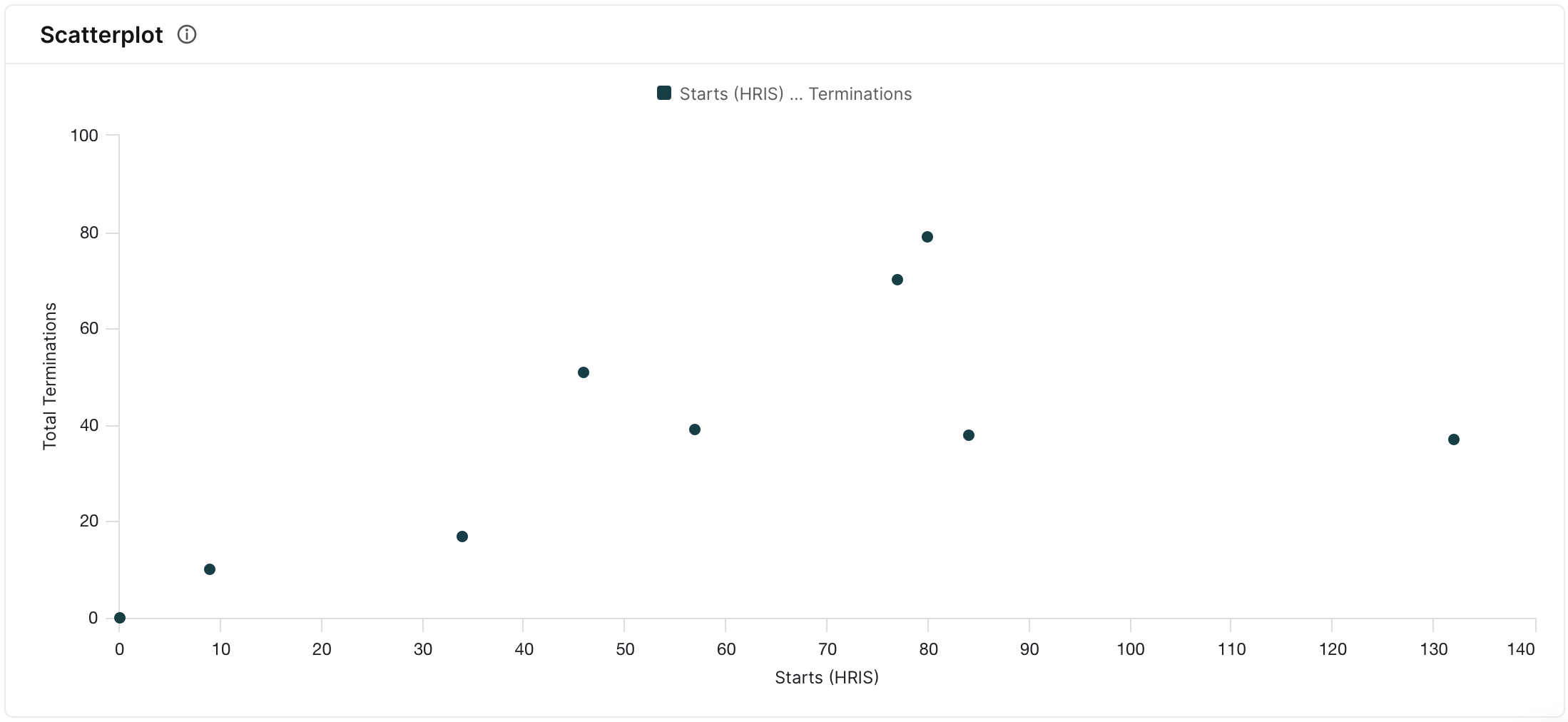
Scatterplot
A Scatterplot displays individual data points on a two-dimensional plane, representing the relationship between two metrics. It is valuable for identifying correlations, patterns, or outliers within a dataset, aiding in the exploration of complex relationships.
To create a scatter chart:
- add two metrics and at least one breakdown
- set visualization type to scatter chart
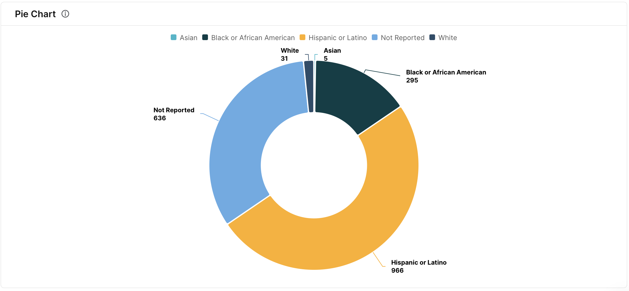
Pie Chart
The Pie chart divides a whole into slices, with each slice representing the proportion of a specific category. It is a useful tool for displaying the composition of a whole in terms of its parts, offering a clear and intuitive representation of relative proportions.
To create a pie chart:
- add one metric and at least one breakdown
- set visualization type to pie chart
- enable value labels as number or percent
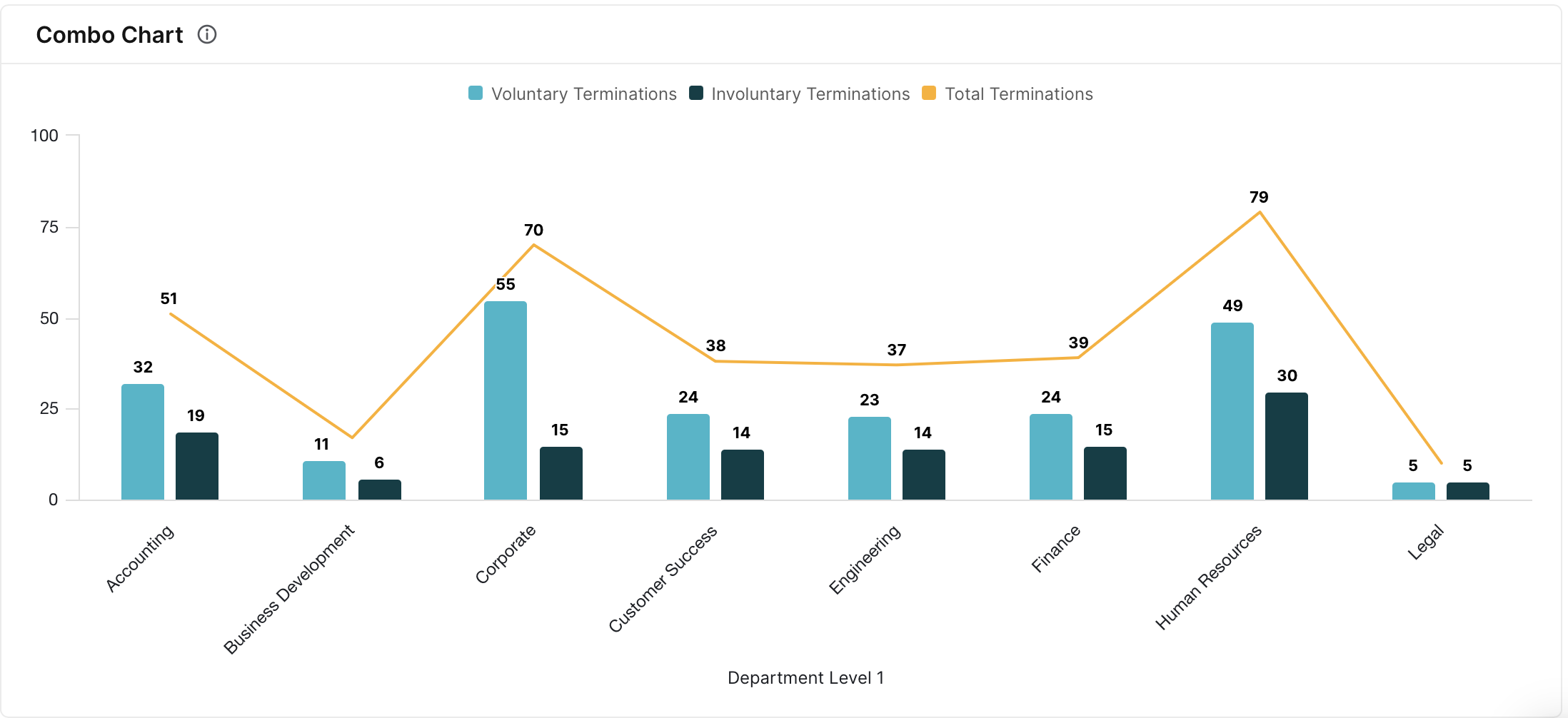
Combo Chart (Line + Bar)
The Combo chart combines both Line and Bar elements, allowing users to visualize multiple metrics or trends in a single view. It is beneficial for comparing different types of data simultaneously, offering a comprehensive analysis within a unified chart.
To create a combo (line + bar) chart:
- add at least two metrics and one breakdown
- set visualization type to bar + line chart
- the last metric added will be represented as a line on the chart while the preceding metrics will be represented as bars
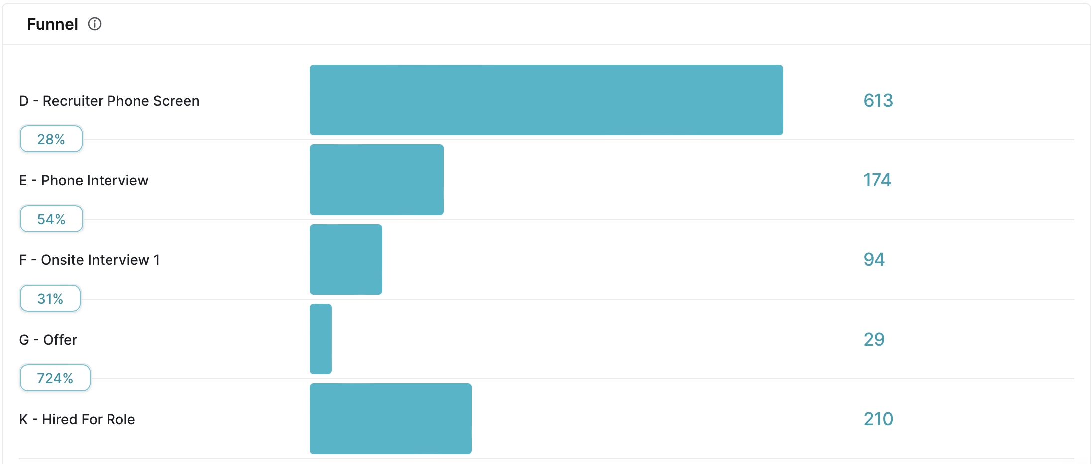
Funnel
The Funnel chart represents a process or conversion sequence with stages depicted as decreasing segments. It is particularly useful for tracking and analyzing step-by-step processes, highlighting potential bottlenecks, and visualizing the progression of data through various stages.
To create a funnel chart:
- add at least one metric and one breakdown
- set visualization type to funnel chart
- set funnel type to vertical, horizontal, or table
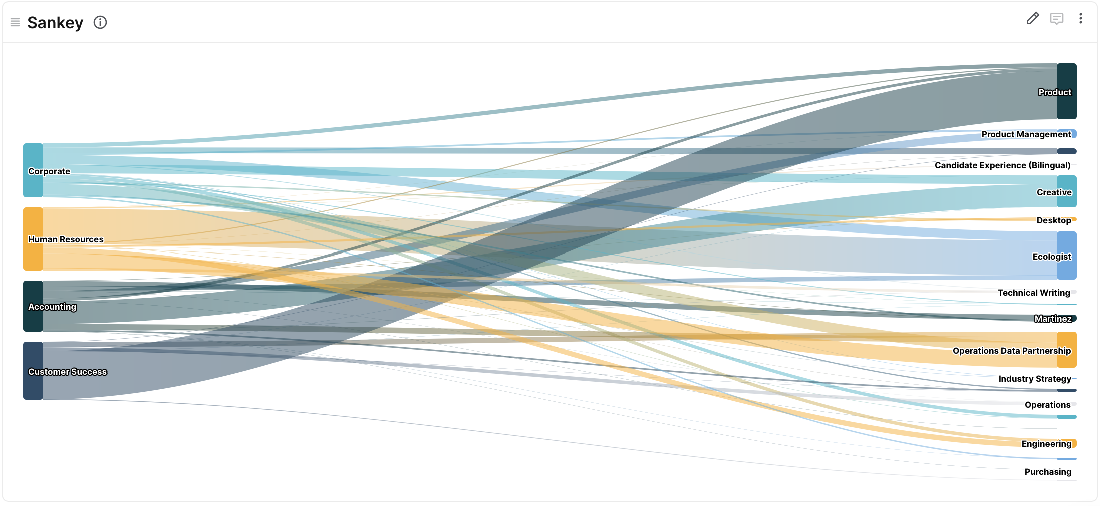
Sankey
The Sankey chart visualizes the flow and relationships between different stages or categories in a system or process. It is useful for understanding the connections and transitions between elements, providing a comprehensive view of the distribution and movement of data within a complex network or workflow.
To create a Sankey chart:
- add one metric and two breakdowns
- set visualization type to sankey chart